PANTONE Color of the Year
Dear PANTONE®,
I love you PANTONE®…. I really do. I have a PANTONE® chart on me at all times. I explain to brides what PANTONE® is and I can reassure them that their bridesmaid’s dress color will certainly match their invitation ink color because PANTONE® is THE universal authority on color. And every year, I wait with anticipation to find out what the Pantone Color of the Year will be. What will brides be looking for? I fantasized about invitations, table numbers and programs, and menus and escort cards – oh my, right there – and the napkins! Everything you can think of with the new Color of the Year. Who will join me in a photo shoot featuring the new color? Where can I get silk and velvet that is a perfect match? You don’t understand, in the wedding industry this moment is HUGE!
On bated breathe I waited. Would it be a shade of Gray – my favorite “neutral” color that makes everything stunning? Or Mint – ahhhh the possibilities with mint and gold foil. Or maybe a deep plum color?! Don’t stop now, maybe a beautiful slate blue, mmmmm. Match slate blue with a silver and I would have passed out with sheer color-orgasmic joy. And oh my, this year you aren’t just going to give me ONE color orgasm – but TWO. Multiple colors??? Yes please, we love multiples.
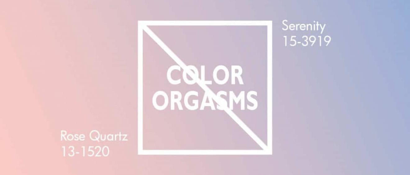
But to my dismay, the Color of the Year was Rose Quartz and Serenity. Rose Quartz is just a fancy, pretty way of saying “blush”. I am SO tired of “blush”! I don’t want BLUSH – I want full out heated color that puts blushing to shame. It has been THE color for weddings for so many years I can’t even remember when there were wedding photos with a REAL color in them. Blush doesn’t show up in print – NOT AT ALL! Blush with white, blush with ivory, blush with cream, “eggshell, ivory and the tiniest hint of the palest blush”, blah, blah, blah. Try photographing a blush and ivory invitation suite and making ANYTHING stand out! Rose Quartz might as well be called “Screaming Child”, “Naked Old Man”, or “Clitorference”. Yes I said it… NO COLOR ORGASMS ARE HAPPENING FOR ME FOR A WHOLE YEAR!!!
Now “Serenity”, I could use some orgasmic serenity – who couldn’t use some of that? But again, I was let down. The palest version of blue doesn’t print EITHER! Put cool blue with ivory and now your ivory looks dull. Put serenity blue with white and try and expose THAT photo of your invitations. Continuing with my “no-color-orgasm-name-calling” but giving equality to the males – Serenity should have been called “Blue Balls”, “Cockblock”, “Granny’s Blue Hair”. “Serenity”? I’m sorry, no serenity was experienced here.
The reason behind the multiple orga . . . sorry, multiple COLORS is a nice sentiment and a message that I like. In a press release from PANTONE®, Leatrice Eiseman, the executive director of the Pantone Color Institute, said:
“In many parts of the world we are experiencing a gender blur as it relates to fashion, which has in turn impacted color trends throughout all other areas of design,”
“This more unilateral approach to color is coinciding with societal movements toward gender equality and fluidity, the consumers’ increased comfort with using color as a form of expression which includes a generation that has less concern about being typecast or judged, and an open exchange of digital information that has opened our eyes to different approaches to color usage.”
So what about Mint Green and a sunny Yellow or ROYGBIV – it was the year of the rainbow after all. Give me a good IV (Indigo and Violet) and I would have found bliss. Or how about some “Christian’s Tie Gray” and “Afterglow” (yes, Afterglow is a true PANTONE® color). Blush – I’m sorry – “Rose Quartz” – has been the color of the wedding industry for the last umpteen years and I’m begging you. PLEASE. PANTONE®, give me my color orgasm back. You don’t want to see this invitation designer with no cOs. I won’t be able to sleep, get creative, or smile “just because”. I want to be sated, not serene.
The orgasmic future of this invitation designer lies in your hands PANTONE®. Please, don’t let me or the other wedding professionals down. We are plum (hint, hint) tired of blush and you have the power to make the change in 2017.
Sincerely,
Frustrated in Michigan
P.S. Now who do I talk to about mason jars?
Pantone LLC, a wholly owned subsidiary of X-Rite, Incorporated, is the world-renowned authority on color and provider of color systems and leading technology for the selection and accurate communication of color across a variety of industries. The PANTONE® name is known worldwide as the standard language for color communication from designer to manufacturer to retailer to customer.
So. Well. Put. No other commentary is needed.